1. Focus on the User
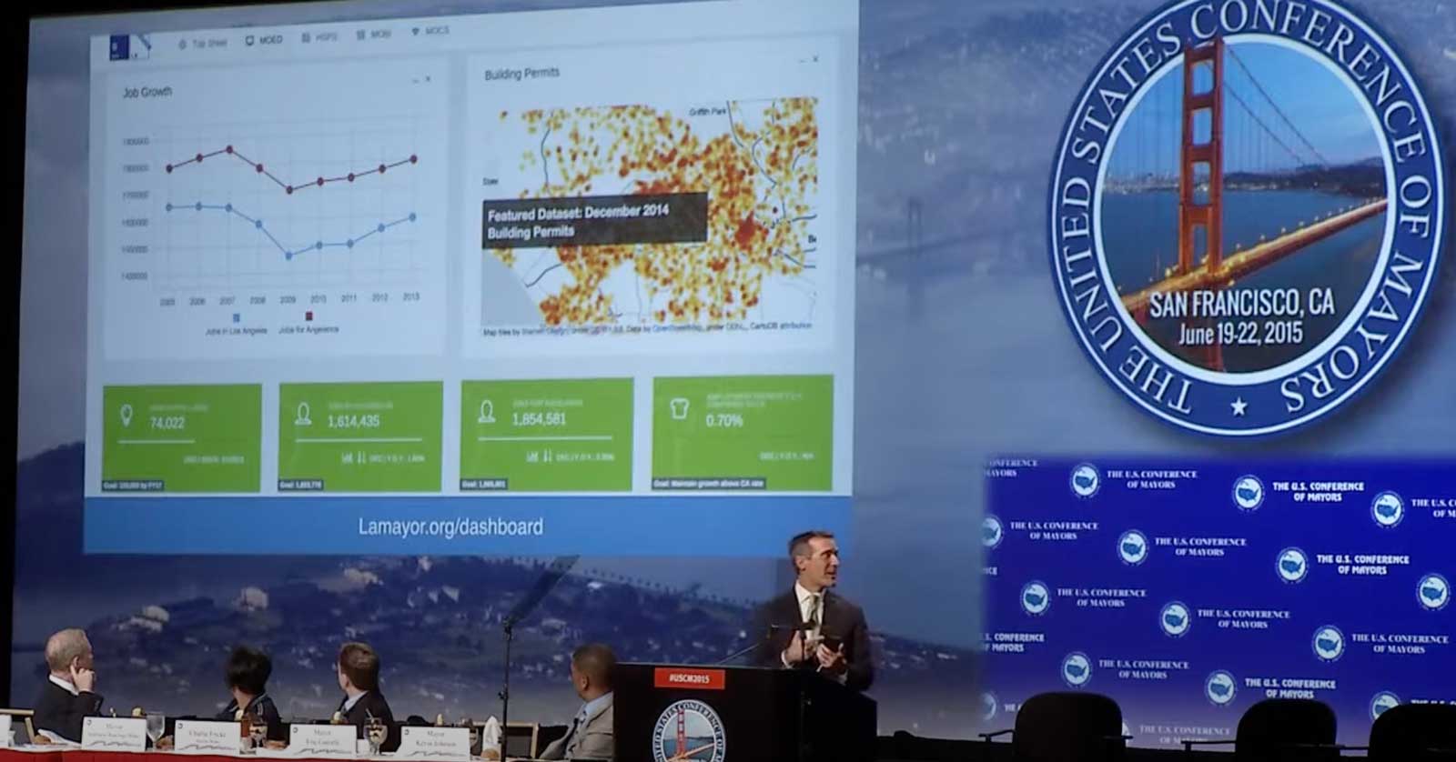
This is a picture of our first data portal from the city of Los Angeles.
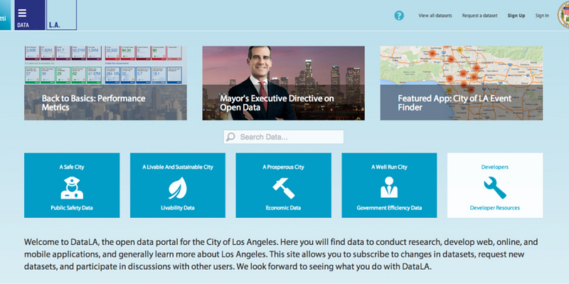
This was launched in June 2014. I started a few months after the launch — in September — and I figured it was a good opportunity to get some feedback and do some user testing. I went around and started doing some basic user feedback. “What is data?” was the question that I got asked the most. So we decided to show, not tell:
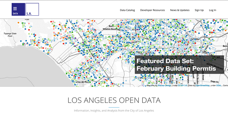
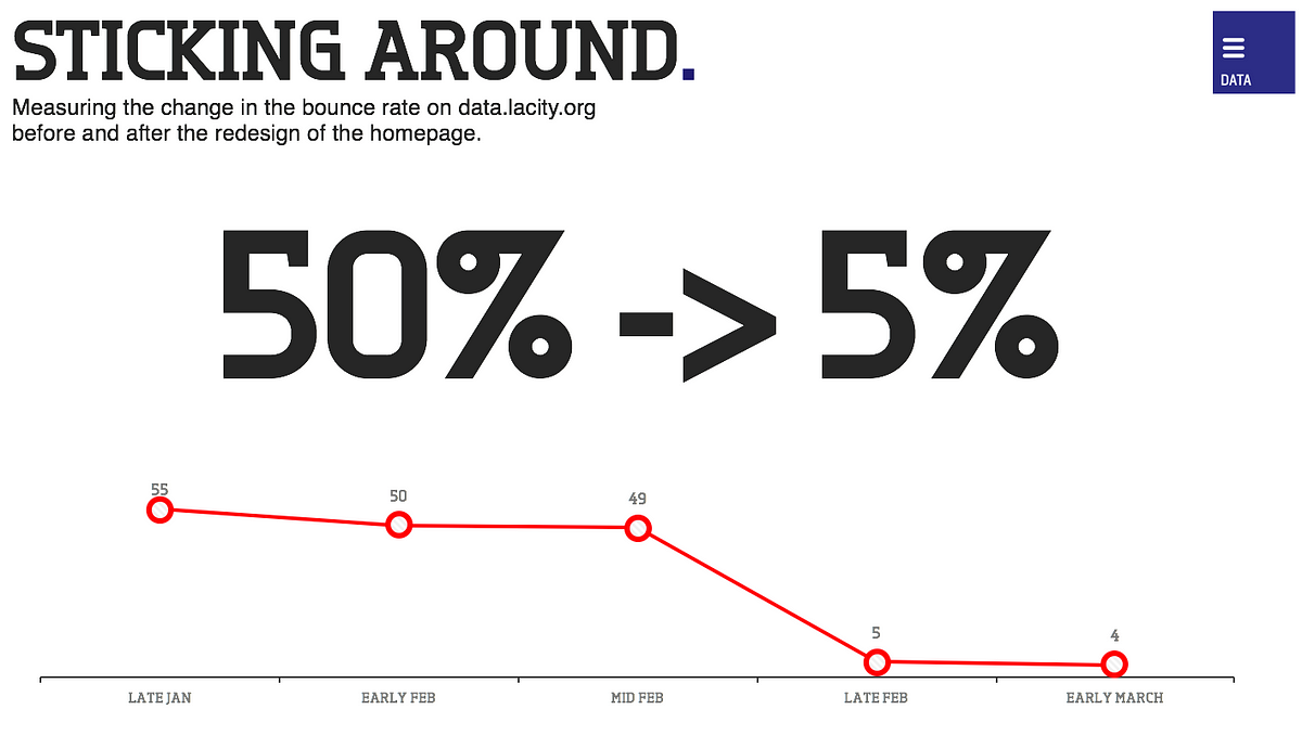
We just put a map, we put points on a map that’s kind of beautiful and simple. It shows building permits that you can actually zoom in and find them near you. We keep it relevant too; if there’s a particular event one week, like this last weekend in Los Angeles we had a big bike festival called CicLAvia, where they shut down parts of the street to let people just bike all along the street, so we put a map of the route front-and center. We made the data portal relevant and visual, and here’s what happened when we did that:
When building open data products, focus on the user.
2. Change the Citizen Experience
We tend to think of open data as something that’s on a portal or maybe on an app that someone’s built, or maybe you download to your computer and do some research on. I think that’s just the start, because the open data that we’re providing can be really meaningful to private businesses, and the interactions you all are creating every day for citizens. Can we take this data that typically is hidden, and put it into the palm of your hand?
Here’s what’s possible when government data goes to work inside consumer platforms: