
Government dashboards have taken many forms, but all struggle with the fact that civic data takes different forms and accordingly have different values when it comes to building useful data products, specifically dashboards. With renewed interest in government data and analytics, developers and designers should be mindful of the different kinds of data and their limitations independently and together for enabling data-driven decisions.

(For an in-depth review, see “What I’ve learned: Three Different Kinds of Civic Data”.)
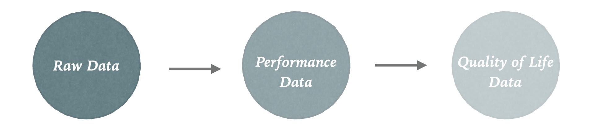
Transactional / Raw Data
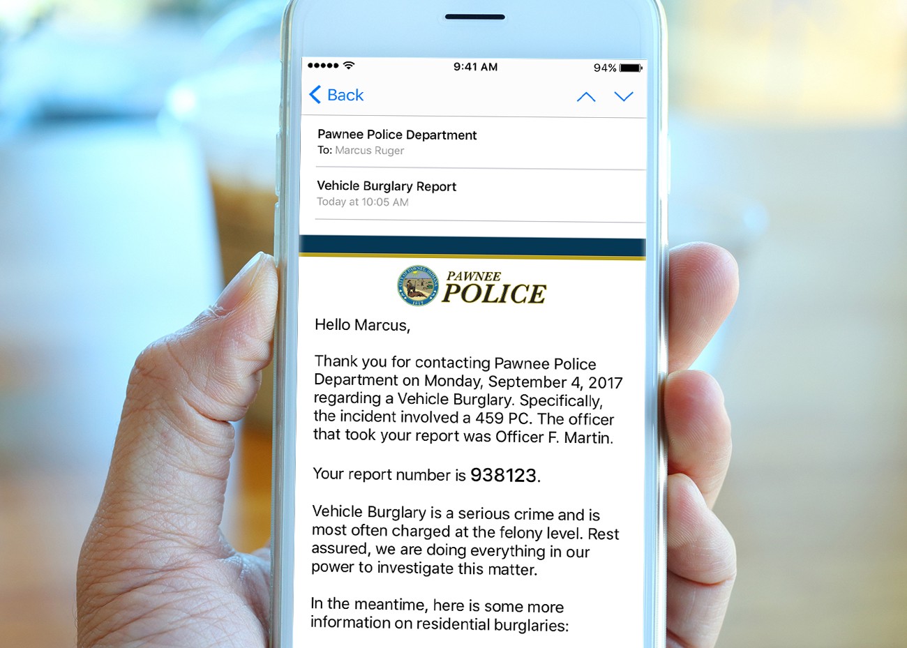
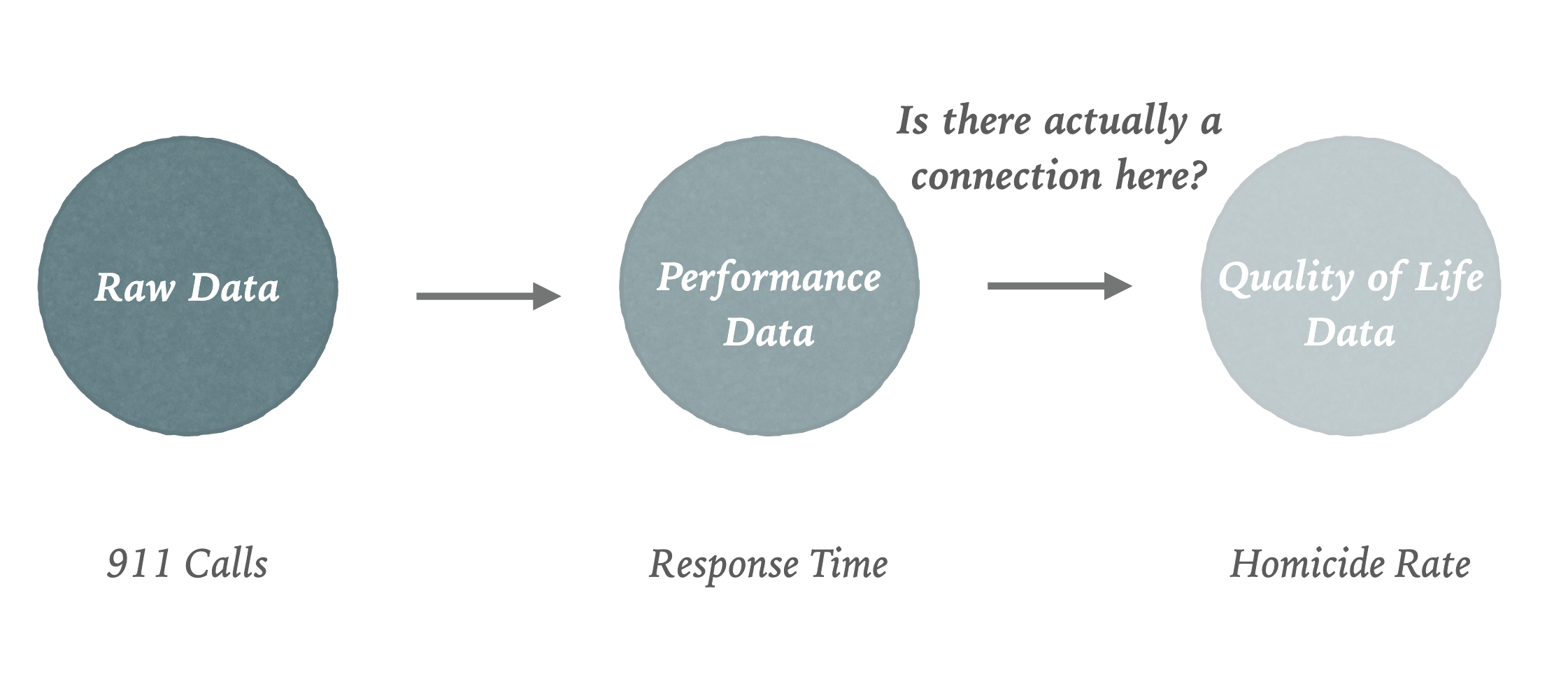
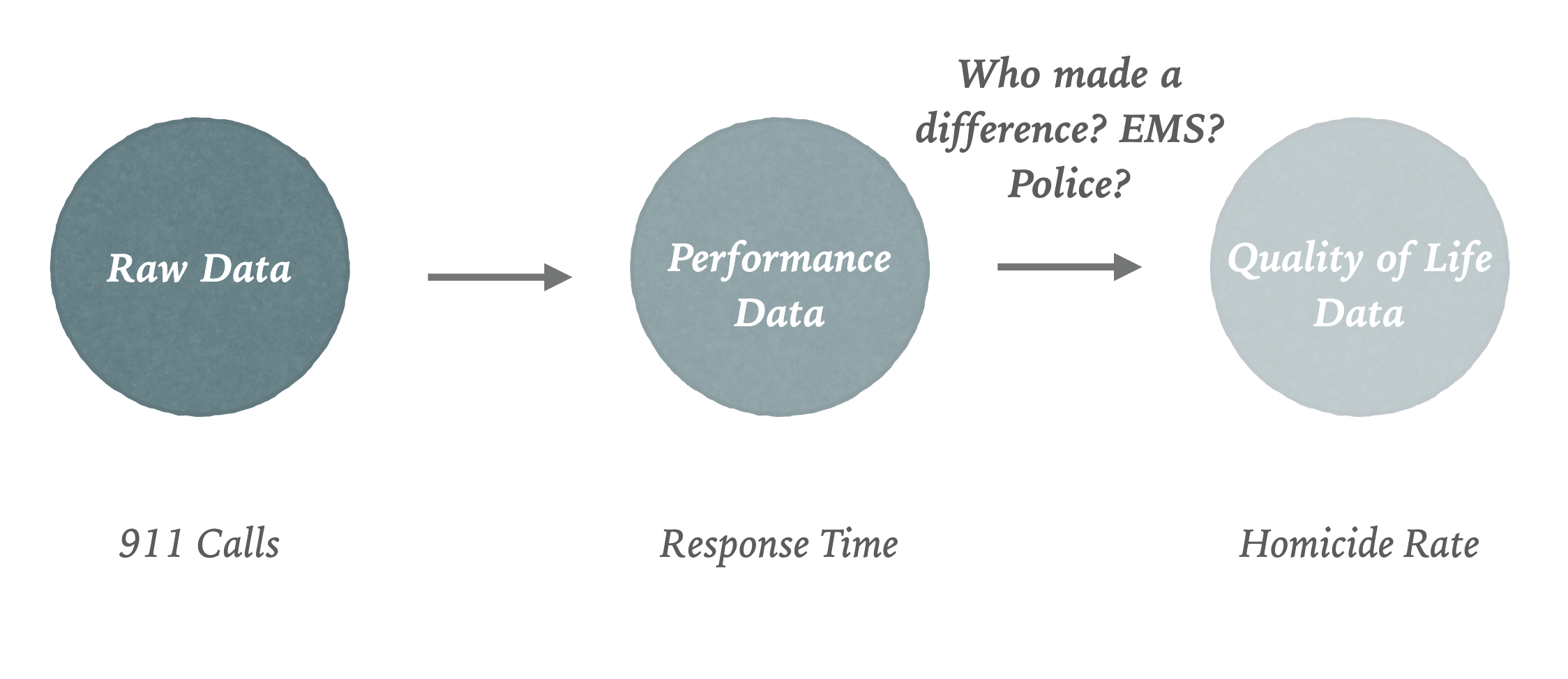
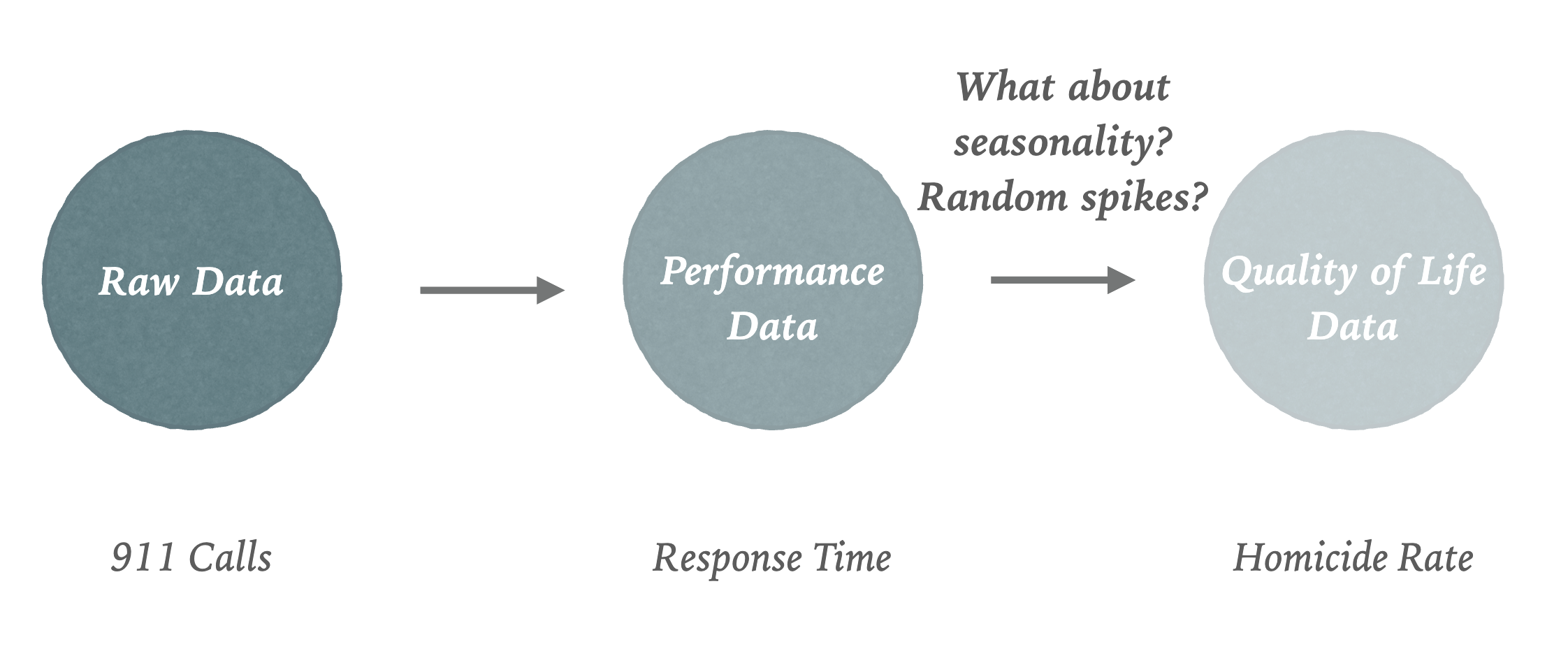
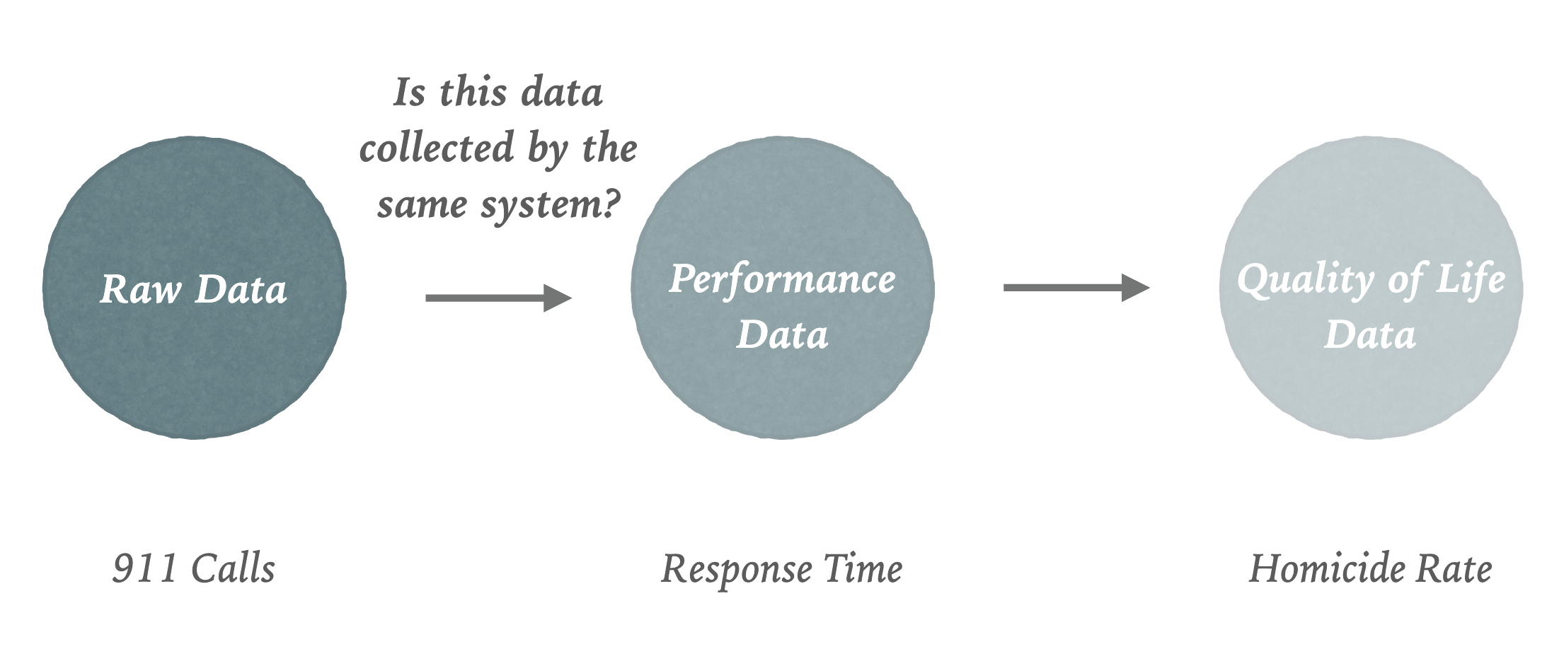
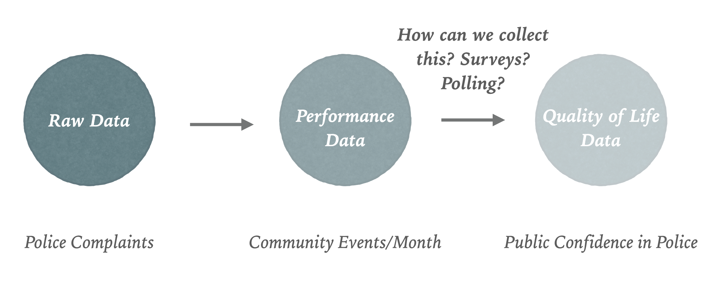
First is transactional or operational data. This is what the city’s doing on a day-to-day basis. Easiest metaphor for that is crime: what crime is happening in the city and where?
Performance Data
The next kind of data is performance metrics. This area is popularized by initiatives such as COMPStat or CitiStat where they look at service delivery levels for performance management through what the private sector would describe as KPIs. In contrast to transactional data, this is aggregate. Instead of looking at every single call that came in to 311, say, you would ask, “What’s our average wait time for it to go in call?” Or “What’s our average time to resolution for a pressing call?”
Quality of Life
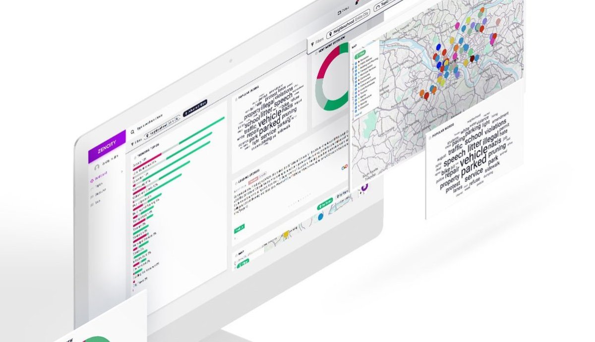
The final piece of this puzzle is probably the most obvious to real citizens: quality of life. How are things going in the city, and more directly, how do people feel about it? Organizations like Pew and others try to collect that data usually at the national level, rarely at the local level, but this is the kind of information we need to know as we govern cities because that’s the ultimate barometer of our success.
The Trouble with Dashboards
These three kinds of data – raw, performance and quality of life – are simply and clearly related.
More importantly, alignment of transactions, performance, and quality of life promises to be the “sweet spot” for data-driven decision making in the public sector.
But the fact that these datasets are decidedly of different kinds means that straightforward dashboarding attempts with transformative ambitions may fail. Indeed, many have, suffering both from user indifference and structural barriers. Cvic data has historically been too messy and the decision-making processes around them less direct, making the promise of clear causal inteventions more of a dream than reality. (See “Open Data: Did We Go the Wrong Way?”.)
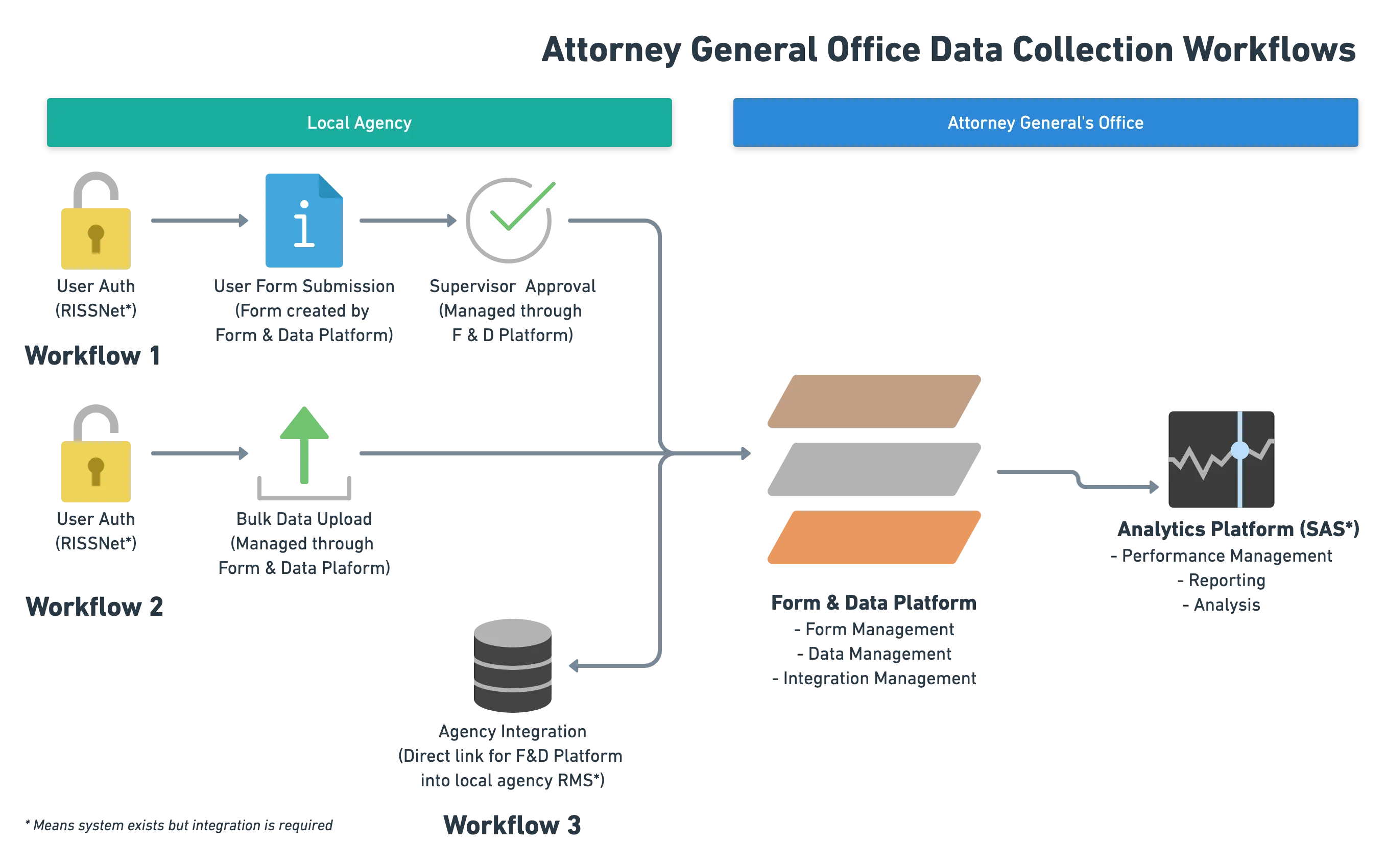
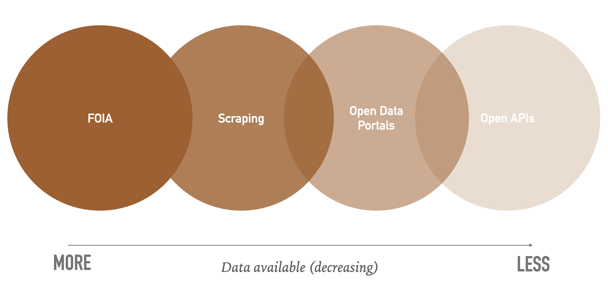
And that’s putting aside the technical issues of data access, reliability, recency, accuracy, and collection:
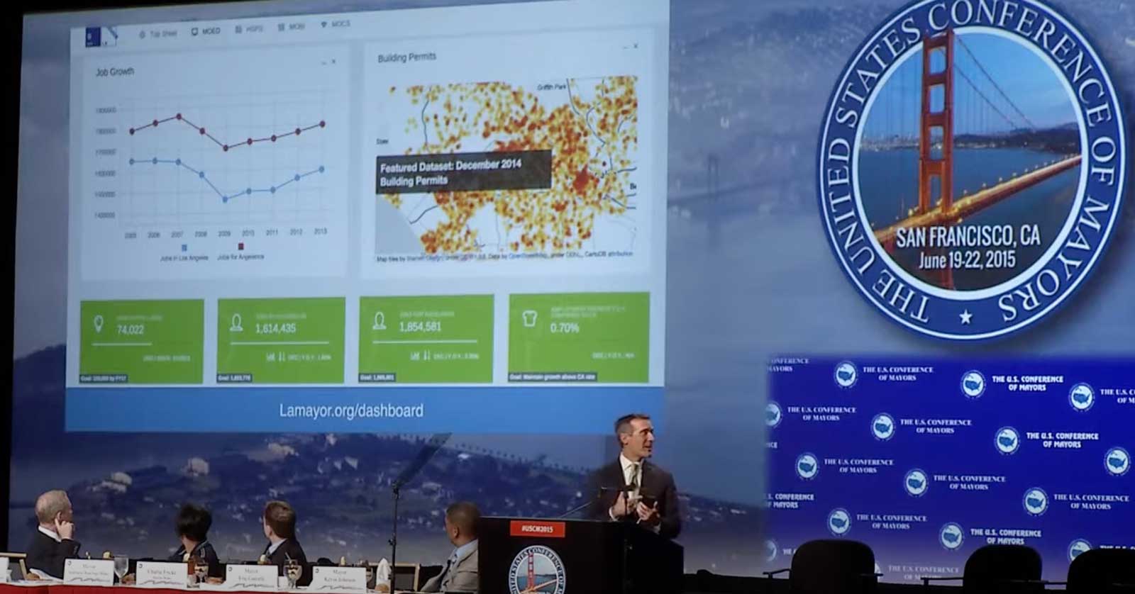
The dashboards that have found success have targeted focus on key stakeholders, and are built around a decision-making process (or person), such as the Mayor of Los Angeles’ dashboard:
But as the digital transformation becomes more real as does the potential for new opportunties to connect the dots with good government data.
Deep Dive: How Civic Data Works
Open Lecture in Browser