
A few years back, I was honored to speak at the installment of my former professor Brock Blomberg as the next president of Urnisus College. My professor taught the Economics portion of the college’s distinctive Philosophy, Politics, and Economics program — a tutorial-based curriculum where you get a taste and a sense of the interconnections between these three key arenas of public life. Professor Blomberg was well aware that covering such deep and vast topics would be impossible in just four short years, indeed this was no triple major. Instead he recommended what he called, “Cocktail party economics”: a daft, yet light understanding of the topic sufficient enough to impress your guests at a cocktail party with a few simple charts and graphs on a handy napkin. Enough to get by, but not too much to bore your neighbors. Sound advice. Accordingly, at his recent inaugural I used this tactic to discuss the chosen topic, “Innovation.” As these illustrations took far more time than anything I’ve made in Keynote and Powerpoint, I figured I’d share them with a few tips on napkin writing for other kindred spirits.
Dummy Supply and Demand graph
 You can basically use to describe anything in economics with enough words and no axis.
Pro-tip: use the side of a notebook to draw straight lines; it’s next to impossible to do it by freehand on a flimsy napkin.
Pie chart to explain what data for a city is and means.
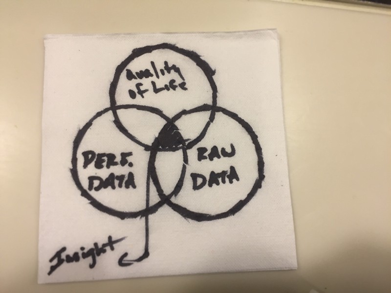 Pro-tip: use the bottom of a cup to draw the circles, and in general, never try to write words — they are illegible. Sharpies were not designed for napkin penmanship.
Exaggerated pie chart to explain that most mobile users open only a handful of apps only once.
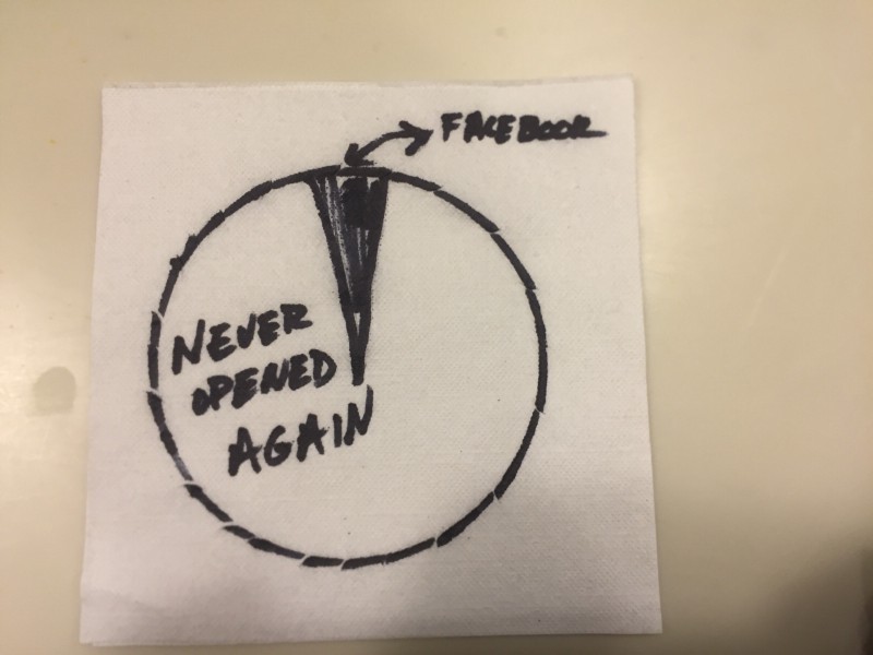 Lesson learned: Apparently using facebook as the go-to app for the college set doesn’t work that well any more. Expected a few more laughs…
Bar charts to illustrate Eric Reis’ observation that 99 percent of startups fail.
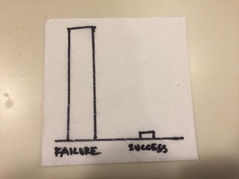 Lesson learned: It’s nearly impossible to draw a 1 percent bar chart with a Sharpie.
Workflow map of a hub-and-spoke model of organization
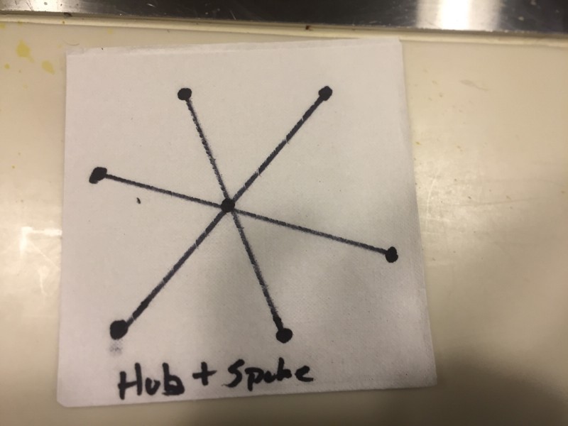 Lesson learned: Hubs and spokes make a lot more sense with a circle drawn around them…
Workflow map of a networked organizational model
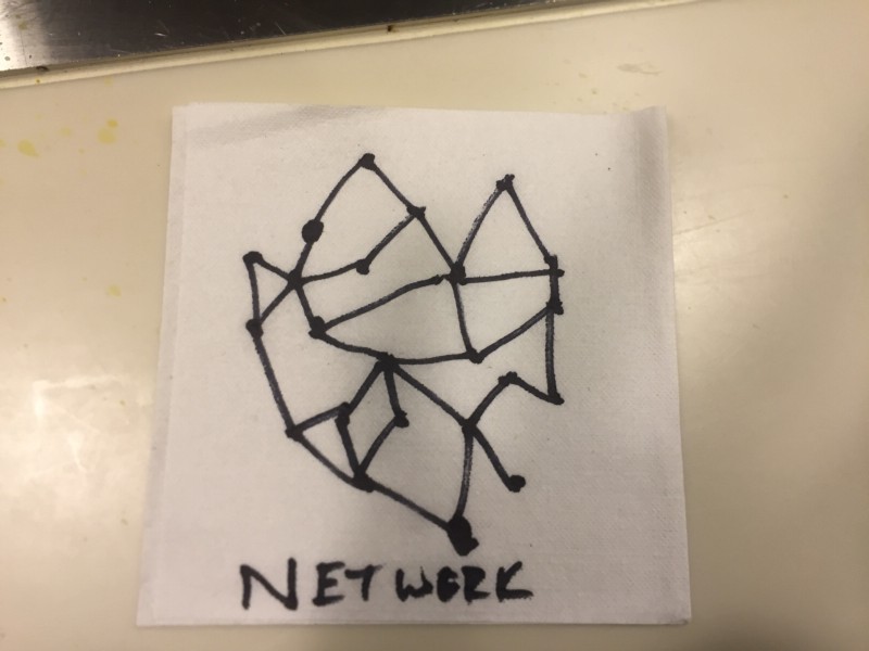 Pro-tip: Next time you think of drawing a network on a napkin, don’t.
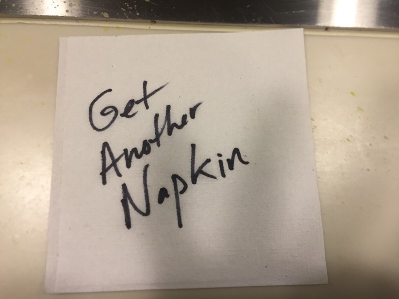
(Failed) Inspirational closing about being able to start fresh
 Lesson learned: When you talk about napkins and especially when you say you should throw them away, don’t accidentally leave one on the stage floor for the next speaker. Makes the next guy’s pictures kind of awkward…